YouTube Banner Size: One Image, Four Different Crops
2560 × 1440 is the figure everyone quotes. The minimum, the safe area and the 6 MB cap are on YouTube's page too, inside a collapsed section, and the safe area it gives is not the one guides repeat.
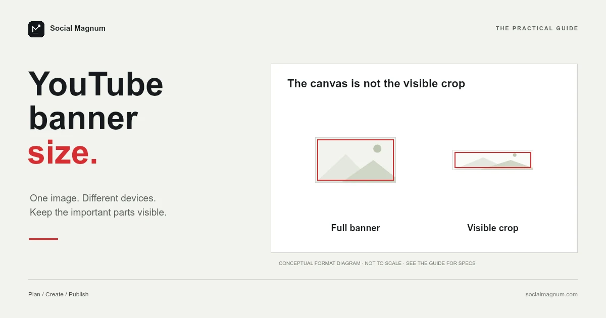
The recommended YouTube banner size is 2560 × 1440 pixels, at 16:9. That is the figure YouTube’s banner tips page gives; its channel branding page adds a minimum, a safe area and a file cap.
YouTube publishes more than that, though not where most people look. Its channel branding page also gives a minimum, a safe area and a file-size ceiling — inside a collapsed section, which is why they are so often reported as undocumented folklore. Here is what each one actually says, and how to design a banner that survives being cropped four different ways.
What size should a YouTube banner be?
| Spec | Figure | Where it comes from |
|---|---|---|
| Recommended size | 2560 × 1440 px | YouTube help page |
| Aspect ratio | 16:9 | Follows from the above |
| Minimum upload | 2048 × 1152 px | YouTube channel branding page |
| Safe area at that minimum | 1235 × 338 px | YouTube channel branding page |
| Safe area at 2560 × 1440 | ≈1546 × 423 px | The same area, scaled up 1.25× |
| Maximum file size | 6 MB or smaller | YouTube channel branding page |
Key facts, read from YouTube’s channel branding page on 21 August 2026: recommended size 2560 × 1440 pixels at 16:9, minimum upload 2048 × 1152, file size 6 MB or smaller, and a safe area for text and logos of 1235 × 338 pixels stated at the minimum dimension. The 1546 × 423 safe area that guides quote is the same region scaled to 2560 × 1440 (multiply by 1.25). YouTube also asks that you leave out shadows, borders and frames. The per-device crops (2560 × 423 desktop, 1855 × 423 tablet, 1546 × 423 mobile) are community figures, not YouTube’s.
Design at 2560 × 1440 and keep everything that matters inside the middle band. That one sentence covers most of what people need. The rest of this explains why the middle band exists and how far it extends.
Why your banner looks different on every device
This is the real problem, and it is not about pixel dimensions at all. You upload one wide image, and YouTube shows a different crop of it depending on what the viewer is looking at.
On a television the full 16:9 image is shown. On a desktop browser you get a wide, short strip through the middle. On a phone that strip narrows further. Nothing is scaled to fit — the edges are simply cut away, by different amounts on every surface.
| Surface | Roughly what is shown | What is lost |
|---|---|---|
| Television | 2560 × 1440 — the whole image | Nothing |
| Desktop browser | 2560 × 423 strip | Top and bottom thirds |
| Tablet | 1855 × 423 strip | Top, bottom and some of each side |
| Mobile | 1546 × 423 strip | Everything outside the centre |
Why the canvas is so much bigger than the visible strip
It is a fair question. If most viewers only ever see a 1546 × 423 slice, why design at 2560 × 1440 at all — why not just make the strip?
Because television is real, and growing. The living-room screen is the one surface that shows the entire image, and it is a large and rising share of YouTube viewing rather than an edge case. Upload a 2560 × 423 strip and it still has to fill a 16:9 television frame, so YouTube either stretches it or pads it, and both look broken on the biggest screen anyone will see your channel on.
The honest way to think about it is that you are designing one asset with two jobs. It has to work as a full 16:9 image on a sixty-inch panel, and as a letterbox strip on a phone. Those are genuinely different compositions, which is why banners are harder to get right than their single dimension suggests — and why so many channels have one that looks fine in exactly one place.
Two safe areas, and why both are right
Every design tool and guide gives the banner safe area as 1546 × 423. YouTube gives it as 1235 × 338. Neither is wrong, and the reason is worth a paragraph because it explains a disagreement that looks like an error.
YouTube states its figure “at the minimum dimension” — that is, the safe area for a banner uploaded at the 2048 × 1152 minimum. The figure everyone else quotes is the same region measured on a banner at the recommended 2560 × 1440.
The arithmetic confirms they describe one area. 2560 ÷ 2048 is 1.25. Multiply YouTube’s 1235 × 338 by 1.25 and you get 1543.75 × 422.5, which is the widely quoted 1546 × 423 to within rounding.
This post originally claimed those figures were undocumented community knowledge. That was wrong, and the reason is worth recording: they sit inside a collapsed section of YouTube’s channel branding page, so searching the banner tips page for them turns up nothing. Absent from the page you happened to read is not the same as undocumented.
Designing so it survives the crop
Everything follows from one constraint: only the centre is guaranteed.
- Channel name, tagline, faces and logos go in the middle band — the central 1546 × 423 region of your 2560 × 1440 canvas.
- The outer regions carry background only. Texture, gradient or flat colour that looks deliberate when it is visible and costs nothing when it is cut.
- Set text far larger than feels right on a 1440-tall canvas. A tagline at 24 pixels disappears once it is scaled into a 423-pixel strip.
- Avoid a hard border or frame. It reads as a design choice on television and as a mistake everywhere else, because the crop slices straight through it.
The most common error is treating the banner as a poster. It is not a poster. It is a letterbox with decorative edges, and the edges are optional.
On text size specifically, it helps to work backwards. The safe area is 423 pixels tall on a 1440-pixel canvas — under a third of the height. A channel name set at 120 pixels occupies about a quarter of that band and stays comfortably readable when the strip is scaled down to phone width. At 48 pixels it is roughly a tenth of the band, which survives on desktop and disappears on mobile. When in doubt, set it larger than looks right and judge it from the cropped preview rather than the full canvas.
File size and format
YouTube states the limit directly: 6 MB or smaller. The same section adds an instruction almost no guide repeats — do not include additional file embellishments such as shadows, borders or frames, which are exactly the decorations that stop reading as decoration once the banner is cropped to a different shape on another device.
Practically, the format choice matters more than the ceiling. Most banners are flat colour, a logo and some type, and that kind of image compresses far better as PNG than people expect, staying sharp at every edge. A photographic banner is the opposite case and should be JPG, where the same visual quality costs a fraction of the bytes.
Either way you are unlikely to approach a few megabytes unless something has gone wrong — usually exporting a photographic banner as PNG, which can multiply the file size several times over for no visible benefit.
Checking your banner before you commit
You do not need to publish to find out whether it works. Crop a copy of your artwork to the central 1546 × 423 region and look at that alone. If the channel name is missing, cut off, or too small to read, the banner fails for most of your audience regardless of how good the full image looks.
It is worth doing the same at desktop proportions, 2560 × 423, since that is the version anyone browsing on a laptop sees. Two crops, thirty seconds, and you have previewed the two views that matter more than the one your editor shows you.
Your profile picture is a separate image
Worth clearing up, because the two get conflated constantly: the round avatar on your channel is not part of the banner. It is a separate upload, and YouTube’s branding page gives it only a render size, 98 × 98, a 15 MB cap and a no-animated-GIF rule, which we unpick in our guide to the YouTube profile picture size.
The widely used figure is 800 × 800, displayed as a circle at a much smaller size. Design on a square canvas, keep the subject central, and assume the corners will be cut — the same discipline the banner needs, at a much smaller scale. A logo that fills its square edge to edge loses its corners to the circular mask.
How to resize an image to 2560 × 1440
If you already have artwork, the job is a crop to 16:9 at 2560 × 1440 followed by an export. The crop is where it goes wrong: a 16:9 frame is very wide, so a photo that was not shot wide either gets squashed or loses most of its height.
Decide which part of the image the frame has to keep before you scale anything. For a banner that point is almost always the centre, because the centre is the only region guaranteed to survive the device crop. It is the rare case where the safest crop and the best-looking crop are the same decision.
Our free image resizer does this in the browser, with no upload to a server and no account. Set the banner dimensions, choose the point the crop should keep, and export. If you are also making a thumbnail for the same channel, the same tool covers that in one sitting.
The banner is the most aggressively cropped image YouTube asks for, but almost every platform crops something. The full set of social media image sizes shows which of those figures are documented and which are convention.
The short version
- 1
YouTube publishes 2560 × 1440 recommended, 2048 × 1152 minimum and a 6 MB ceiling
- 2
It gives the safe area as 1235 × 338 at the minimum; 1546 × 423 is the same area at 2560 × 1440
- 3
Only the central strip is guaranteed — everything important belongs there
- 4
The profile picture is a separate square image, and its corners get masked off