LinkedIn Banner Size: 1584 × 396 for Profiles, 1512 × 256 for Pages
Two different images with two different shapes. The Company Page cover is 1512 × 256 — and the three figures circulating instead of it are not wrong in the same way.
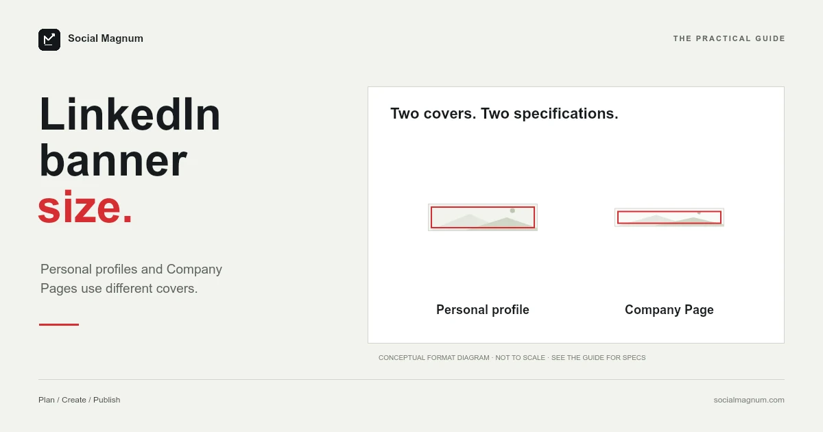
A LinkedIn personal profile banner is 1584 × 396 pixels. A LinkedIn Company Page cover image is 1512 × 256 pixels. Those are two different images with two different shapes, and conflating them is the reason so many LinkedIn headers look wrong.
The second number is also the one almost nothing on the internet gets right. Search this and you will be offered 1128 × 191, 4200 × 700 or 1536 × 768 for the company cover, depending on which result you land on. LinkedIn’s own specification page says none of those.
What size is a LinkedIn banner?
| Image | Size | Source |
|---|---|---|
| Personal profile banner | 1584 × 396 | Universal convention |
| Company Page cover | 1512 × 256 | LinkedIn help page |
| Company logo | 400 × 400 (min 268 × 268) | LinkedIn help page |
| Life tab main image | 1128 × 376 | LinkedIn help page |
| Link post image | 1200 × 627 (1.91:1) | LinkedIn help page |
| Maximum file size | 3 MB, PNG or JPEG | LinkedIn help page |
Key facts, read from LinkedIn’s image specifications page for Pages and Career Pages on 21 August 2026: Company Page cover 1512 × 256 pixels, where minimum and recommended are the same figure; Page logo 400 × 400 with a 268 × 268 minimum; Life tab main image 1128 × 376; link-post image 1.91:1 at 1200 × 627 and more than 200 pixels wide; all images PNG or JPEG, 3 MB maximum, with LinkedIn recommending a high-resolution JPEG. The personal profile banner, which LinkedIn calls the background photo and most people call the cover photo, is 1584 × 396 (4:1) by universal convention; we found no LinkedIn help page that publishes it.
The Company Page cover is 1512 × 256
LinkedIn publishes this plainly, in a table, with the same figure given as both the minimum and the recommended size. There is no ambiguity in the source at all — the ambiguity is entirely downstream of it.
Before writing any of them off, it is worth doing the division, because the three wrong answers are not wrong in the same way and the difference decides how much it matters.
Two of them are the right shape at the wrong size
| Figure | Aspect ratio | Verdict |
|---|---|---|
| 1512 × 256 — LinkedIn | 5.906:1 | The specification |
| 1128 × 191 — AI Overview | 5.906:1 | Identical shape, lower resolution |
| 4200 × 700 | 6:1 | Near enough in shape, far larger |
| 1536 × 768 | 2:1 | A genuinely different shape |
1,128 × 191 is not a mangled number. Scale 1512 × 256 down to a width of 1,128 and the height comes out at exactly 191. It is the same rectangle, and it is almost certainly LinkedIn’s previous published size, still circulating years later.
That is a milder problem than it first looks. Build at 1128 × 191 and your cover will fit correctly — it will simply be softer than it needed to be, because you supplied about half the pixels LinkedIn now asks for. On a high-density screen that is visible.
The 4200 × 700 figure is 6:1, close enough in shape to sit correctly, and dramatically larger than anything LinkedIn asks for. It is the only one of the three where the 3 MB file ceiling becomes a real risk.
The 1536 × 768 figure is the genuine outlier. At 2:1 it is three times taller in proportion than the cover LinkedIn specifies, so it is not a resolution problem at all — it is the wrong rectangle, and it will be cropped hard.
The file limit is 3 MB, not 8 MB
LinkedIn states it in a single line above the specification table: all images must be PNG or JPEG files, with a maximum size of 3 MB.
Google’s AI Overview for this query says 8 MB. So do several of the guides it draws from. If you have been exporting large, lightly compressed banners on the assumption that you had eight megabytes to play with, you have most likely had uploads rejected without understanding why.
Three megabytes is generous for an image this shape. A 1584 × 396 banner is a wide, short strip with relatively few pixels in it — a well-exported JPEG will usually land well under a megabyte.
LinkedIn asks for JPEG rather than PNG
This one is worth knowing because it runs against the usual instinct. Most platform guidance treats the two formats as interchangeable, and designers tend to reach for PNG on the assumption that lossless means better.
LinkedIn is explicit in the other direction: to achieve the best image resolution, use the recommended dimensions and choose a high-resolution JPEG instead of a PNG.
There is one qualification worth adding from the same page. Your logo is displayed on both light and dark backgrounds, and a transparent logo will be shown on white — which is a PNG concern, since JPEG has no transparency. The JPEG advice is about photographic cover images, not about every asset you upload.
The personal profile banner: 1584 × 396
Most people searching for a LinkedIn banner size want this one — the wide image behind your own profile, not a company page.
1584 × 396 is a 4:1 ratio and it is completely uncontroversial: every guide, every template and every design tool uses it. Worth being straight, though, that it sits on different footing from the numbers above. LinkedIn’s published specification page covers Pages and Career Pages, and we could not find an equivalent published spec for the personal profile background photo. 1584 × 396 is universal convention rather than something we could confirm at the source.
That does not make it doubtful. Unanimous agreement across every tool that has to actually upload the file is strong evidence. It does mean it belongs in a different mental category from 1512 × 256, which you can go and read for yourself.
What sits on top of your banner
Getting the dimensions right does not stop the image being obscured, and the two banners are obscured in different places.
- On a personal profile, your profile photo overlaps the banner near the lower left, and your name and headline sit below it. Anything you place in that corner is behind a circle.
- On a Company Page, LinkedIn’s own advice is to keep key details away from the edges and especially out of the lower-right corner, because the cover is trimmed differently across screen sizes.
Both come down to the same working rule: put anything that must be read toward the middle, and treat the corners as decoration. A 4:1 strip is an unforgiving shape for text at the best of times, and it gets narrower on a phone.
LinkedIn also warns that the cover image may be adjusted to fit the screen, trimming it horizontally or vertically, and recommends limited text for exactly that reason. A banner carrying a long tagline is a banner that will lose part of it on some device.
People often search for a separate mobile banner size, and there is not one. You upload a single image and the app trims it to whatever shape the screen needs, which on a phone means a noticeably narrower slice through the middle than the one you designed. The answer is not a different file — it is leaving enough margin in the one file you have.
Post images are a different question again
People searching for a LinkedIn banner size often want a post size five minutes later, so it is worth separating the two clearly.
For a post that shares a link, LinkedIn gives an explicit spec: use a 1.91:1 ratio at 1200 × 627 pixels, and the image must be more than 200 pixels wide. That is the preview card image, and it is the same ratio most platforms use for link previews, which is convenient if you are producing one asset for several networks.
For an image posted directly rather than attached to a link, square at 1080 × 1080 is the working convention — LinkedIn does not publish a figure for it on the Pages specification page, so it sits in the same category as the 1584 × 396 personal banner: universal in practice, not something you can cite.
The one hard rule that carries across all of them is the 3 MB ceiling and the PNG-or-JPEG requirement, which LinkedIn applies to images generally rather than to any one slot.
We went through the link-card condition and LinkedIn’s pad-not-crop behaviour in our guide to the LinkedIn post size.
Banner size in inches and centimetres
Google lists this among the related searches in inches, centimetres and millimetres, for the same reason it does on every size query: print-oriented design tools ask for physical units that the platform never uses.
A LinkedIn banner has no physical size. At the 96 pixels-per-inch web standard, 1584 × 396 is 16.5 × 4.125 inches, or roughly 41.9 × 10.5 centimetres. At the 300 DPI print default the same pixels come out at 5.28 × 1.32 inches. Both are correct arithmetic and neither is useful — set your document units to pixels and type the numbers in.
How to resize an image for a LinkedIn banner
A 4:1 strip is the hardest common crop in social media. Almost nothing you photograph is that shape, so the crop discards most of the height of whatever you started with, and the result depends entirely on which horizontal band you keep.
That makes the decision worth making deliberately rather than accepting a centre crop. A landscape photograph often has its subject well above or below the middle, and a 4:1 frame centred by default will slice straight through it.
Our free image resizer does this in the browser, with no upload to a server and no account. Set 1584 × 396 for a profile or 1512 × 256 for a Page, choose the point the crop should keep, and export as JPEG to stay comfortably inside the 3 MB limit. Once the image is right, Social Magnum can schedule the post itself to your LinkedIn Company Page alongside 20+ other networks.
LinkedIn is unusual in publishing a minimum and a recommendation that are the same figure. Our guide to social media image sizes sets that against every other platform and shows which numbers are actually documented.
The short version
- 1
Personal profile banner: 1584 × 396, a 4:1 strip — universal convention
- 2
Company Page cover: 1512 × 256, per LinkedIn's own specification page
- 3
1128 × 191 is the same 5.9:1 shape as 1512 × 256 at lower resolution; Canva's 1536 × 768 is the one genuinely wrong rectangle
- 4
Maximum file size is 3 MB, and LinkedIn asks for JPEG rather than PNG