LinkedIn Post Size: The Number Everyone Quotes Is the Link Card
LinkedIn publishes 1200 x 627 and says in the same breath that it does not apply to image posts. It also says it will not crop your feed image at all, which undoes the premise of every guide on this subject.
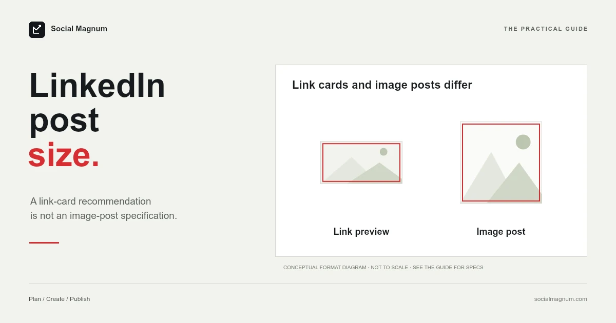
Half the guides for this question say 1200 × 627. LinkedIn does publish that figure — and says, in the same section, that it does not apply to ordinary image posts.
The other half say 1080 × 1080. LinkedIn does not publish that anywhere. And the thing neither half mentions is that LinkedIn says it will not crop your feed image at all.
What size should a LinkedIn post image be?
Key facts, read from LinkedIn’s image specifications page (‘last updated 1 day ago’ on 21 August 2026): for a page post with a URL, use a 1.91:1 image at 1200 × 627 pixels, more than 200 pixels wide, or it renders as a small left-hand thumbnail. LinkedIn states this does not apply to an image-only or image-and-text post, where the image is enlarged to fit the feed, that images on mobile will not be cropped, and that other ratios appear in full with subtle white padding. All images must be PNG or JPEG under 3 MB, with a high-resolution JPEG preferred. LinkedIn publishes no feed-image dimension; 1080 × 1080 square or 1080 × 1350 portrait is the working LinkedIn post image size.
1200 × 627 is the link-card size
The figure is real and it is LinkedIn’s. The context around it is what gets dropped.
It appears under a heading about adding custom images to a page post with a URL — that is, the preview card generated when you share a link. For that case LinkedIn asks for a 1.91:1 ratio at 1200 × 627.
So the most-quoted number for LinkedIn post images is the specification for a different kind of post, reproduced without the condition attached to it.
LinkedIn pads rather than crops
This is the finding that matters most, because it contradicts the assumption the whole genre rests on.
LinkedIn states that images on mobile will not be cropped, and that images of other ratios appear in full size with subtle white padding.
Almost every size guide — including several of ours about other platforms — is built on the idea that the wrong shape gets cut. On LinkedIn feed images, LinkedIn says the wrong shape gets framed instead.
It also means the advice to keep everything important centred, which is genuinely necessary on Facebook covers and YouTube banners, is much less urgent here.
1920 × 1080 is not portrait
Two of the pages ranking for this term describe 1920 × 1080 as the portrait option for LinkedIn posts. It is landscape.
1920 pixels wide by 1080 pixels tall is the standard widescreen shape — the one every television and YouTube video uses. A portrait version would be 1080 × 1920, the numbers the other way round.
| Written as | Actually | Because |
|---|---|---|
| 1920 × 1080 (portrait) | Landscape, 16:9 | Wider than it is tall |
| 1080 × 1920 | Portrait, 9:16 | Taller than it is wide |
| 1080 × 1080 | Square, 1:1 | Equal |
It is the same class of mistake we found on Instagram Story sizes, where a page in position two calls 1080 × 1920 a 16:9 ratio. Orientation and ratio both get transposed constantly, and both are checkable in about five seconds.
Most of page one is LinkedIn posts about LinkedIn
Something unusual is happening with this query, and it explains the inconsistency.
Four of the nine results sit on linkedin.com. Only one of them is LinkedIn’s own help documentation. The other three are Pulse articles — posts written by individual members and published on the platform.
One of those Pulse posts is five years old. It has more than seven hundred reactions and it still ranks on the first page for a query about current specifications. It is also one of the two that calls 1920 × 1080 portrait.
What LinkedIn does publish
LinkedIn is precise about Page images, which is worth having in one place since these are the figures that genuinely come from LinkedIn.
| Image | Minimum | Recommended |
|---|---|---|
| Page logo | 268 × 268 | 400 × 400 |
| Page cover | 1512 × 256 | 1512 × 256 |
| Life tab main image | 1128 × 376 | 1128 × 376 |
| Life custom modules | 502 × 282 | 502 × 282 |
| Company photos | 264 × 176 | 900 × 600 |
Three of those five have an identical minimum and recommendation, which is unusually helpful — there is no gap to misread. We wrote about the Page cover specifically in our guide to the LinkedIn banner size, where the web offers at least three wrong numbers for it.
The advice LinkedIn gives about its cover
Alongside the numbers, LinkedIn offers guidance on Page images that is more specific than most platforms bother with, and two points generalise well beyond LinkedIn.
- Keep key details away from the edges, especially the lower right. LinkedIn names that corner directly, because a Page cover is adjusted to fit different screens and may be trimmed horizontally or vertically.
- Test your logo on light and dark backgrounds. LinkedIn displays it on both, and notes that a transparent logo will be shown on white — so a white wordmark with a transparent background disappears entirely in one of the two contexts.
That second one is a genuinely common failure and almost never mentioned in a size guide, because it is not a size problem. A logo can be exactly 400 × 400, under 3 MB, in an accepted format, and still be invisible half the time.
LinkedIn asks for JPEG over PNG
A recommendation that runs against normal instinct, stated plainly: to achieve the best image resolution, LinkedIn suggests using a high-resolution JPEG rather than a PNG.
That is the opposite of the usual advice for graphics and text, where PNG keeps edges crisp. LinkedIn’s reasoning is not given, but the practical constraint is visible in the 3 MB ceiling: a high-resolution PNG of a detailed image hits that limit quickly, and something has to be sacrificed to get under it.
Both formats are accepted. If your image is a photograph, JPEG is the right answer anyway. If it is a chart or a wordmark, this is one of the few places where a platform explicitly asks you to reconsider.
The 200-pixel rule
One more specific behaviour, and it is the sort of thing that produces a post that looks broken without explaining why.
For a post with a URL, LinkedIn requires the image to be more than 200 pixels wide. Below that, it does not fail — it renders as a small thumbnail to the left of the post instead of as a full-width card.
So a link that previews as a large image on one site and a postage stamp on yours is usually an image-width problem in the page’s own metadata, not a LinkedIn fault.
What to actually use
Pulling the verified parts together into something usable.
- Sharing a link: 1200 × 627, a 1.91:1 ratio, and over 200 pixels wide. This one is documented and specific.
- Posting an image: LinkedIn publishes no dimension. Square at 1080 × 1080 is a sound convention, and portrait occupies more feed height.
- Either way: PNG or JPEG, under 3 MB, with JPEG preferred for resolution.
And because LinkedIn pads rather than crops, the penalty for getting the second one wrong is smaller than any guide on this subject implies.
Changing the shape of what you have
Most of this comes down to converting an image you already own into a shape that fills more of the feed.
Going from a wide photograph to a square or portrait crop throws away width, so the decision is which part to keep — and a default centre crop is right only when your subject is already centred.
Our free image resizer does this in the browser with no upload and no account, and our guide to social media image sizes marks which figures across every platform are documented and which are only widely agreed. Once the image is right, Social Magnum can schedule the post itself to your LinkedIn Company Page alongside 20+ other networks.
The short version
- 1
1200 × 627 is the spec for a post with a URL, and LinkedIn says so explicitly
- 2
LinkedIn does not crop feed images on mobile — it pads them with white
- 3
Two page-one results call 1920 × 1080 portrait, and it is landscape
- 4
Three of the top eight results are member posts on LinkedIn, one five years old
- 5
All images must be PNG or JPEG under 3 MB, and LinkedIn prefers JPEG