Instagram Story Size: 1080 × 1920, and What the Interface Covers
The dimensions are settled — every page agrees on 1080 × 1920. What is not settled is whether that is 9:16 or 16:9, and how much of your frame Instagram's own interface sits on top of.
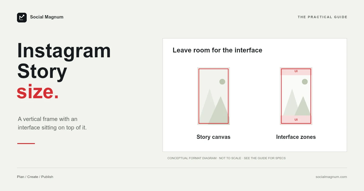
An Instagram Story is 1080 × 1920 pixels, at a 9:16 aspect ratio. That part is settled — every page ranking for this question agrees on it, which is not something you can say about most platform dimensions.
The two things that are not settled are the ones that actually cost people work: whether the ratio is 9:16 or 16:9, which a page currently in position two gets backwards, and how much of your frame the interface covers up. This is both, and then how to crop an image to fit without losing the subject.
What size is an Instagram Story?
| Spec | Figure |
|---|---|
| Dimensions | 1080 × 1920 px |
| Aspect ratio | 9:16 — taller than it is wide |
| Safe area | Roughly the middle 1080 × 1420 |
| Keep clear | About 250 px at the top and 250 px at the bottom |
Key facts: an Instagram Story is 1080 × 1920 pixels at 9:16, a figure every design tool and guide uses and that Instagram’s reel help page, read 21 August 2026, frames as the tall end of its accepted 1.91:1 to 9:16 range. Instagram publishes no Story safe area; the usual guidance of keeping about 250 pixels clear at the top and bottom, leaving a central 1080 × 1420 band, is a community measurement of where the username, progress bars and reply box sit. 9:16 means taller than wide: 1080 divided by 1920 is 0.5625, and so is 9 divided by 16.
9:16 or 16:9? They are not the same thing
Google lists “Are stories 16:9?” among the questions people ask about this, and it is easy to see where the doubt comes from.
The convention is that the numbers follow the shape: width first, height second. So 16:9 is wide — a television, a YouTube video, a laptop screen. 9:16 is the same rectangle stood on its end, which is what a phone held normally looks like.
The arithmetic settles it in one step. 1080 ÷ 1920 gives 0.5625, and 9 ÷ 16 gives the same 0.5625. If it were 16:9 the image would be 1920 wide and 1080 tall — a landscape picture, which is the opposite of a Story.
Meta’s own documentation uses the same convention. Instagram’s help page for reels states that it accepts “an aspect ratio between 1.91:1 and 9:16”, with 9:16 as the tall extreme of the range. Nothing in Meta’s material describes full-screen vertical content as 16:9.
The Instagram Story safe zone: what the interface covers up
This is the part worth your attention, because the dimensions are trivial and the safe area is where designs actually fail.
Your Story is not shown as a clean rectangle. Instagram draws its own interface on top of it, and that interface sits over your image rather than beside it.
- The top carries your profile picture, your username, the timestamp and the progress bars for the Story sequence.
- The bottom carries the reply box, and often a share or react control alongside it.
- The sides and the whole frame are tap targets — a tap advances or goes back, so anything that looks like a button in your design competes with a gesture that already exists.
The practical rule that comes out of this is to treat roughly the top 250 pixels and the bottom 250 pixels as unusable for anything that must be read. That leaves a central band of about 1080 × 1420 where text and faces are genuinely safe.
Stickers, polls and links take space as well
The 250-pixel rule accounts for Instagram’s fixed interface. It does not account for anything you add on top, and in practice that is what fills a Story up.
A poll, a question box, a countdown, a link sticker, a music strip, a location tag — each one occupies a real block of the frame, and they tend to land in the middle where your design already is. A Story built to fill the safe area edge to edge has nowhere left to put a poll except over the thing it was meant to complement.
The habit worth forming is to design the sticker in from the start. Decide where the link or the poll will sit, leave that region deliberately quiet in the artwork, and the finished Story looks composed rather than assembled. It is the difference between a layout with a hole in it and a layout with a space in it.
Highlights crop your Story into a circle
Anything you save to a Highlight gets a second life in a shape nothing about the original design anticipated: a small circle on your profile (the same circular crop as your profile picture).
That crop comes from the centre, which means a 9:16 frame is reduced to roughly its middle square and then masked to a circle. A headline placed comfortably inside the safe area can be cut in half by it, and a subject positioned slightly off-centre can vanish from the cover entirely.
If Highlights matter to you, the practical answer is to make covers deliberately rather than accepting the automatic crop — a simple centred icon or word on a plain background reads far better at that size than any crop of a busy Story will. It is also worth remembering that Highlight covers are seen far more often than the Stories inside them, because they sit permanently on your profile.
Where the safe-zone numbers come from
Worth being straight about this: Instagram does not publish a safe area for Stories. The 250-pixel figures are community convention — measured by designers from the actual interface and repeated until they became the standard.
That does not make them wrong. They describe real behaviour, and every serious template uses them. It does mean they are approximate rather than exact, and that they can drift when Instagram redesigns something. Treat them as a sensible margin rather than a boundary with legal force, and give yourself a little more room than the minimum when a design allows it.
If your image is the wrong shape
Stories are forgiving in a way feed posts are not. Upload something that is not 9:16 and Instagram will not refuse it — it fits the image into the frame and fills whatever is left over, usually with a blurred, stretched copy of the image itself or a colour drawn from it.
That is a reasonable fallback and it looks exactly like what it is. A landscape photo in a Story becomes a small band in the middle of the screen with a smeared background above and below, which reads as unfinished next to anything designed for the frame.
The fix is to decide the crop yourself. A vertical crop from a landscape photo throws away a lot of width, so the question is which part you keep — and that is a judgement about the picture, not something an algorithm can make for you.
Formats and limits are another thing Instagram’s help pages do not state for Stories. The figures every guide gives are JPG or PNG for images, MP4 or MOV for video, and roughly 30 MB per image; treat them as convention, like the safe zones.
Designing for phones that are not exactly 9:16
One more wrinkle that catches people out: very few current phones are actually 9:16. Most are noticeably taller — 19.5:9 and 20:9 are common — which means a 1080 × 1920 Story does not map perfectly onto the screen it is displayed on.
The app handles it by scaling your image to fill and trimming the overflow, so on a taller phone slightly more of the top and bottom is lost than the 250-pixel rule assumes. It is another argument for keeping the important part of the frame near the middle rather than pushed to the edge of the safe area.
Designing at 1080 × 1920 remains right. It is the shape Instagram expects, and the small variation between handsets is handled for you as long as you have not placed anything critical where the trimming happens.
Feed posts are a different shape entirely, see Instagram post size; Reels share the 9:16 frame but add a cover you cannot redo, see Instagram Reel size.
Story size in inches and centimetres
Google lists this among the related searches, in both units, for the same reason it does on every other size query: design tools built for print ask for physical measurements that the platform never specifies.
A Story has no physical size. At the 96 pixels-per-inch web standard, 1080 × 1920 works out at 11.25 × 20 inches, or roughly 28.6 × 50.8 centimetres. At the 300 DPI print default the same pixels are 3.6 × 6.4 inches. Both are arithmetically correct and neither is useful — set your document units to pixels and enter 1080 × 1920 directly.
How to resize an image to 1080 × 1920
The work is a vertical crop, and it is a demanding one. Going from a horizontal photo to 9:16 discards most of the width, so the result depends entirely on which part of the frame you keep.
Decide that before you scale anything. A face, a product, a horizon line — whatever the picture is about should be the thing the frame holds onto, and everything else falls outside it. Then check the crop against the safe area, because a subject that sits perfectly in the frame can still end up behind the reply box.
Our free image resizer does this in the browser, with no upload to a server and no account. Choose the Story dimensions, set the point the crop should keep, and export. If the source is much wider than it is tall, the fill option is usually a better result than forcing an extreme crop.
The safe area is a community measurement rather than a published figure, and it is not the only number in this field with that problem. Our guide to social media image sizes separates the documented figures from the merely agreed-upon ones.
The short version
- 1
Instagram Stories are 1080 × 1920 pixels at 9:16 — taller than wide, not 16:9
- 2
Keep roughly 250 px clear at the top and bottom for Instagram's own interface
- 3
Those safe-zone figures are community convention, not published by Instagram
- 4
A wrong-shaped image is not rejected — it is placed on a blurred fill, which looks unfinished